Mastering Lettering Embellishments and Flourishes.
In the world of lettering, there is a timeless beauty in the art of embellishments and flourishes. These decorative elements add flair, elegance, and personality to written words, transforming them into visual masterpieces. Whether you are a calligrapher, graphic designer, or simply someone who appreciates the beauty of handcrafted lettering, mastering the art of embellishments and flourishes can elevate your work to a whole new level.
In this blog post, we will delve into the techniques, tips, and tricks to help you enhance your lettering with stunning embellishments and flourishes. We will explore the importance of balance, spacing, and creativity in creating visually appealing designs. So, let’s dive in and unlock the secrets to mastering this exquisite art form.
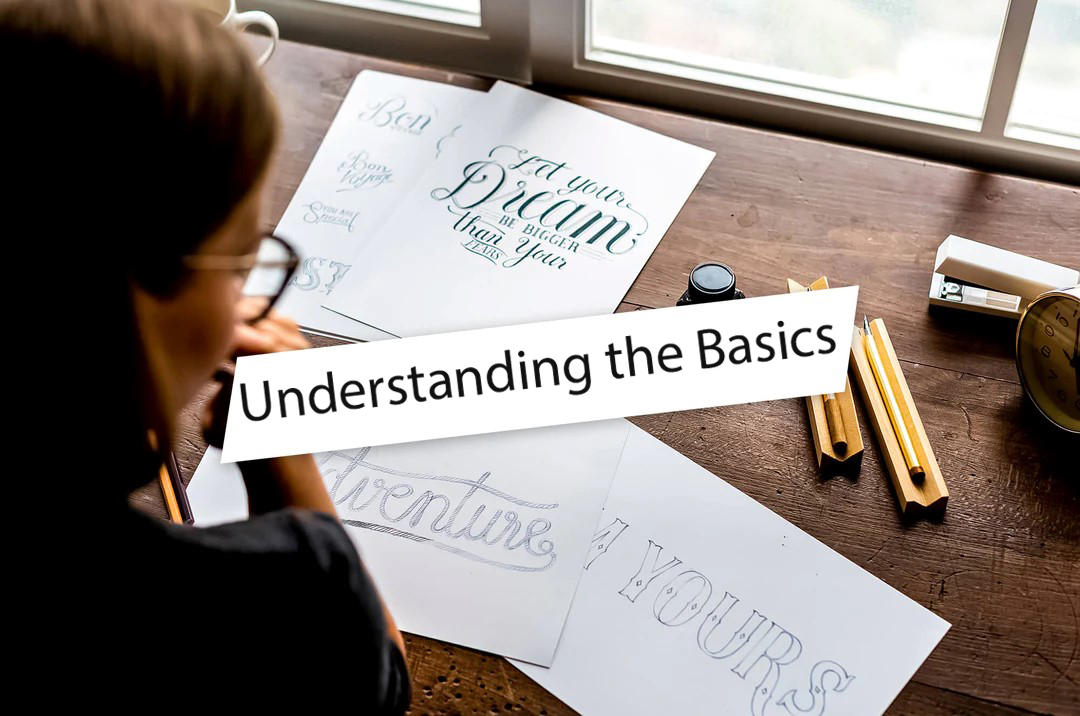
1. Understanding the Basics:
Developing a strong foundation is crucial before venturing into the world of embellishments and flourishes. Familiarize yourself with various lettering styles, such as brush techniques, calligraphy, or handcrafted designs, and dedicate time to perfecting consistent letterforms.
By immersing yourself in different lettering techniques and honing your skills in creating uniform letter shapes, you will establish a solid base. This foundation will prove invaluable when seamlessly incorporating captivating embellishments and flourishes into your artistic work.
With a deep understanding of various styles and the ability to consistently produce visually appealing letterforms, you will have the tools to elevate your artwork with eye-catching embellishments and flourishes.
2. Balancing Act:
Achieving a harmonious balance is essential when integrating embellishments and flourishes into your lettering. The goal is to ensure that each flourish complements and harmonizes with the letterforms and the overall composition. Strive for a well-balanced distribution of visual weight, where the embellishments enhance the letters rather than overshadowing them.
To achieve this balance, it’s important to experiment with various factors such as sizes, shapes, and placements of the embellishments. Try different sizes of flourishes to see how they interact with the letterforms. Explore different shapes of embellishments and their impact on the overall composition. Additionally, experiment with the placement of the flourishes, considering both proximity to the letters and their arrangement within the composition.
Through this process of experimentation, you’ll be able to find the perfect balance that elevates your lettering. Remember, the aim is to create a visual harmony where the embellishments enhance the letterforms, creating a captivating and well-balanced composition.

3. Spacing and Flow:
Proper spacing and flow are vital in creating visually pleasing embellishments and flourishes. Pay attention to the negative space around and within the letters, allowing room for the embellishments to breathe.
Strive for a seamless flow of movement, where the eye effortlessly travels from one flourish to another. Consistency in spacing and flow will create a cohesive and aesthetically pleasing design.
4. Creativity Unleashed:
While it’s essential to understand the foundational principles, don’t be afraid to let your creativity shine through. Experiment with different styles, shapes, and patterns to develop your unique embellishment repertoire. Draw inspiration from nature, architecture, or even everyday objects.
Incorporate your personal style and imagination into your designs to make them truly distinctive.

5. Harmonizing with Typography:
To craft visually stunning designs, it is vital to establish a harmonious relationship between the embellishments and flourishes and the selected typography. Take into account the mood and style of the lettering, and carefully choose embellishments that not only complement but also elevate the overall aesthetic of the composition.
Consider the characteristics of the typography, such as its thickness, curvature, or serif style, and seek embellishments that align with these attributes. For instance, if the lettering has a flowing and elegant script, delicate and graceful flourishes would enhance its beauty. On the other hand, if the typography is bold and angular, incorporating sharp and bold embellishments would create a visually cohesive design.
By creating a cohesive visual language between the letterforms and the embellishments, you will achieve a captivating composition that seamlessly merges the two elements together. The goal is to ensure that the embellishments enhance the typography and contribute to the overall impact and aesthetic appeal of the piece.
6. Using Imagery in Lettering:
Beyond flourishes and embellishments, incorporating imagery within your lettering can add another layer of creativity and intrigue. Experiment with integrating small illustrations, motifs, or icons that relate to the theme or message of your lettering piece.
This combination of visual elements will captivate the viewer’s attention and create a memorable impact.
Mastering the art of embellishments and flourishes in lettering requires patience, practice, and a keen eye for aesthetics. By understanding the fundamentals of lettering, balancing the visual elements, and letting your creativity soar, you can create captivating and visually appealing designs. So, go ahead and explore the world of embellishments and flourishes, and let your lettering become a true work of art.